Opened on 06/11/2015 at 03:43:26 PM
Closed on 07/14/2016 at 05:24:32 PM
#2675 closed defect (fixed)
Eyeo website's header misaligned at small view port sizes
| Reported by: | Shikitita | Assignee: | juliandoucette |
|---|---|---|---|
| Priority: | P2 | Milestone: | |
| Module: | Websites | Keywords: | |
| Cc: | saroyanm, sven, greiner, gnarfer | Blocked By: | |
| Blocking: | Platform: | Unknown | |
| Ready: | yes | Confidential: | no |
| Tester: | Unknown | Verified working: | no |
| Review URL(s): | |||
Description (last modified by Shikitita)
Environment
Platform: iPhone 5s
Operating System: iOS 8.1.3
Browser: Safari or Adblock Browser
How to reproduce
- Open a browser, either Safari or Adblock Browser
- Access the website www.eyeo.com
Observed behaviour
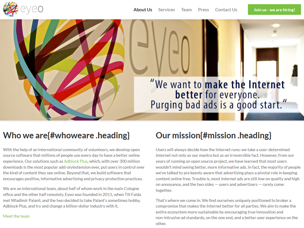
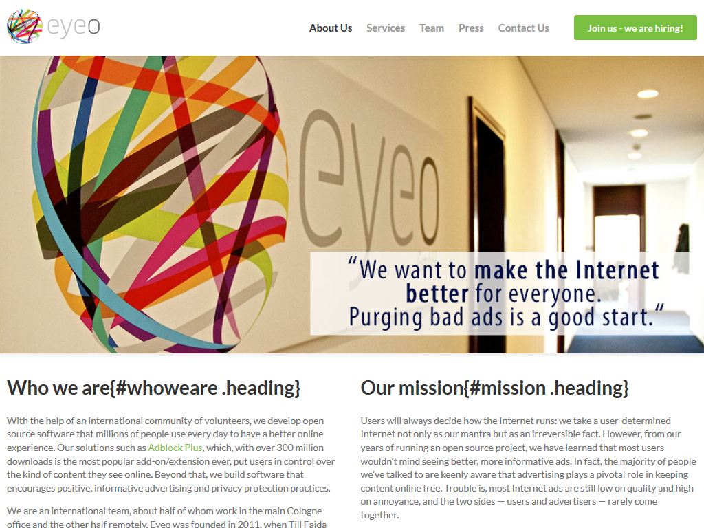
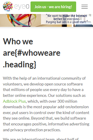
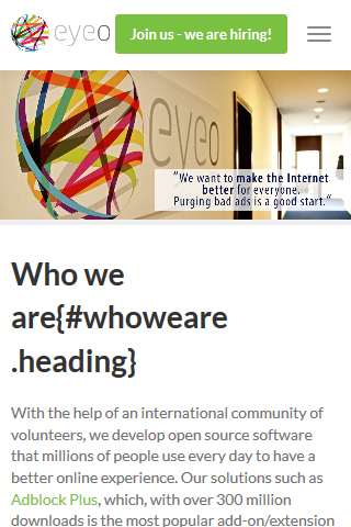
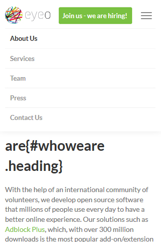
As shown in the attached screenshot the logo at the top of the page is causing a concatenation with the text "About us", as well as the green button "Join us - we are hiring!" appears off screen and it cannot be read completely unless dragging the website to the left.
Please note that this occurs on a viewport size is 320 x 568 with whichever browser.
Expected behaviour
There should be a space between the logo and the text in order not to cause a concatenation, whereas the green button should be changed in size if possible and moved to the left in order for it to appear inside the screen and being able to read the text.
Attachments (12)
Change History (30)
Changed on 06/11/2015 at 03:44:55 PM by Shikitita
comment:2 Changed on 06/11/2015 at 04:12:35 PM by philll
- Summary changed from Eyeo website's header should be adjusted to Eyeo website's header misaligned at small view port sizes
comment:3 Changed on 06/17/2015 at 09:02:56 AM by saroyanm
- Priority changed from Unknown to P2
- Ready set
comment:4 Changed on 06/17/2015 at 09:07:41 AM by saroyanm
- Cc greiner added
comment:5 follow-up: ↓ 6 Changed on 06/17/2015 at 11:31:49 AM by sven
You could also add a burger menu like this page is doing it
comment:6 in reply to: ↑ 5 Changed on 06/17/2015 at 02:06:23 PM by saroyanm
Replying to sven:
You could also add a burger menu like this page is doing it
We also have burger menu in https://adblockplus.org/ I'm looking to theguardians current implementation, doesn't looks good, actually they had a website redesign lately, so could be a sideefect on their side.
I'll create hamburger menu, but I'm mostly thinking how it make sense to deal with the green button for Jobs page. Should it stay there ? Should I change it's style and put under the hamburger menu ?
comment:7 Changed on 06/17/2015 at 04:35:51 PM by sven
Should I change it's style and put under the hamburger menu ?
Sounds good to me.
Changed on 06/22/2015 at 03:06:28 PM by greiner
comment:8 Changed on 06/22/2015 at 03:07:27 PM by greiner
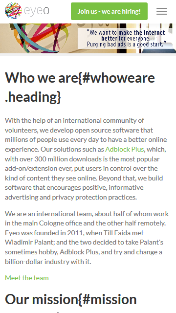
We could make this work without a hamburger menu but in any case I'd suggest not to hide the "Join us - we are hiring!" button somewhere. Therefore I'd advise against that menu in favor of making the elements flow vertically (see screenshot).
comment:9 Changed on 08/21/2015 at 11:54:44 AM by greiner
- Sensitive set
- Tester set to Unknown
comment:10 Changed on 01/29/2016 at 01:15:40 PM by juliandoucette
- Owner set to juliandoucette
comment:11 Changed on 01/29/2016 at 05:50:59 PM by juliandoucette
- Review URL(s) modified (diff)
- Status changed from new to reviewing
comment:12 Changed on 02/02/2016 at 03:48:27 PM by juliandoucette
- Cc gnarfer added
comment:13 Changed on 02/02/2016 at 04:20:49 PM by philll
- Sensitive unset
Changed on 02/03/2016 at 11:22:38 AM by juliandoucette
Changed on 02/03/2016 at 11:22:47 AM by juliandoucette
Changed on 02/03/2016 at 11:22:58 AM by juliandoucette
Changed on 02/03/2016 at 11:23:07 AM by juliandoucette
Changed on 02/03/2016 at 11:23:24 AM by juliandoucette
Changed on 02/03/2016 at 11:23:37 AM by juliandoucette
Changed on 02/03/2016 at 11:23:53 AM by juliandoucette
Changed on 02/03/2016 at 11:24:09 AM by juliandoucette
Changed on 02/03/2016 at 11:24:20 AM by juliandoucette
comment:14 Changed on 02/03/2016 at 11:35:46 AM by juliandoucette
I have added screenshots of my solution.
This shows:
- Generic desktop, tablet, large phone (phablet), and mobile views
- NOTE: The actual braking points points are 768 (desktop -> tablet) and 660 (tablet -> phone)
This does not show:
- I removed the header animation on scroll in favor of a permanently fixed header
- NOTE: I kept the same header padding difference between top and scrolled
- I exported the Eyeo logo at 2x the resolution for high DPI screens
Can I please get some feedback on this Christiane?
Changed on 02/18/2016 at 01:37:53 PM by christiane
comment:15 Changed on 02/18/2016 at 01:41:30 PM by christiane
I would just make one change. see screenshot i've just attached.
just make the green button slightly smaller on mobile so that the space between Eyeo logo and button is the same as between Button and menu icon, please.
The rest looks good.
comment:16 Changed on 02/23/2016 at 03:24:21 PM by juliandoucette
Thanks Christiane :) . I have updated my patch in review to accommodate your suggestion.
comment:17 Changed on 07/14/2016 at 05:22:34 PM by abpbot
A commit referencing this issue has landed:
Issue 2675 - Implemented responsive header for web.eyeo.com
comment:18 Changed on 07/14/2016 at 05:24:32 PM by juliandoucette
- Resolution set to fixed
- Status changed from reviewing to closed
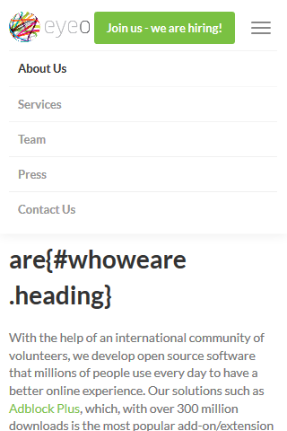
The solution for this issue should be to make the menu items flow vertically on smaller screens, update the position for the header to make it relative.
The question is how make sense to deal with the green "join us" Button, the easiest should be keep it in it's place and only make the other buttons flow vertically.
@Sven feel free to give suggestion in case you have special suggestion from design perspective of view, otherwise I'll go with the suggestion above and align with you whether it's looks okey for you during implementation.