Opened on 04/04/2017 at 07:23:41 PM
Closed on 09/04/2017 at 05:24:27 PM
#5105 closed change (fixed)
Move right video above content on Acceptable Ads Certification Tool page of acceptableads.com
| Reported by: | juliandoucette | Assignee: | |
|---|---|---|---|
| Priority: | P3 | Milestone: | |
| Module: | Websites | Keywords: | |
| Cc: | athornburgh, jeen, saroyanm, p.pastourmatzis, jobp, wspee | Blocked By: | |
| Blocking: | Platform: | Unknown / Cross platform | |
| Ready: | yes | Confidential: | no |
| Tester: | Unknown | Verified working: | no |
| Review URL(s): | |||
Description (last modified by juliandoucette)
Background
The 1/2 column right video on the Acceptable Ads Certification Tool page of acceptableads.com looks a little awkward on tablet and desktop.
What to change
Change the 1/2 columns to 7/12 columns and move the video underneath the heading and hr.
Attachments (6)
Change History (21)
comment:2 in reply to: ↑ 1 Changed on 04/04/2017 at 07:33:12 PM by athornburgh
Replying to juliandoucette:
I can create a mockup if product thinks this is a good idea.
I think it's a good idea and a mockup would be niece as well :)
Changed on 04/10/2017 at 03:17:34 PM by juliandoucette
Large desktop
Changed on 04/10/2017 at 03:17:48 PM by juliandoucette
Small desktop
Changed on 04/10/2017 at 03:18:11 PM by juliandoucette
Large tablet
Changed on 04/10/2017 at 03:18:26 PM by juliandoucette
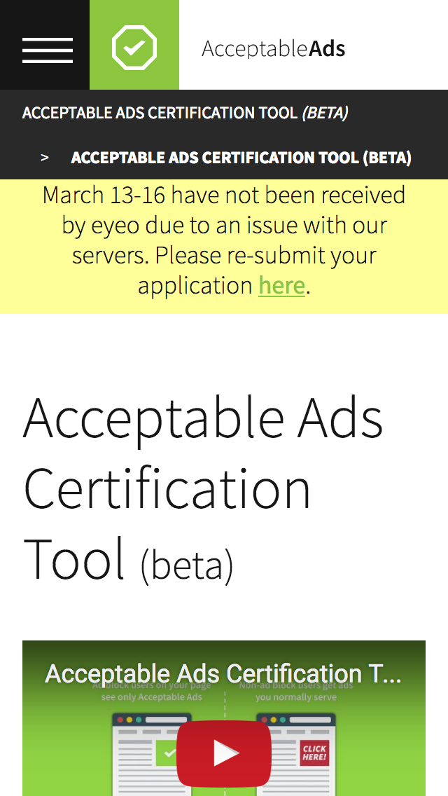
Small phone
comment:3 Changed on 04/10/2017 at 03:19:44 PM by juliandoucette
This is not looking so hot (especially because of the yellow notice which prevents the text from being seen above the fold). I tried 1/2 column but I thought it looked better as 2/3 column on desktop and tablet. Let me know what you think.
comment:4 Changed on 04/10/2017 at 03:21:27 PM by juliandoucette
- Priority changed from Unknown to P4
comment:5 Changed on 04/10/2017 at 03:21:44 PM by juliandoucette
- Priority changed from P4 to P5
comment:6 follow-up: ↓ 7 Changed on 04/12/2017 at 12:51:51 PM by jeen
I've got some questions/ feedback:
- Why is the Acceptable Ads certification tool (Beta)repeated twice in the breadcrumb? This seems to be a mistake.
- For smaller screens, we should reduce the font size and corresponding padding down. Right now the font size and padding all remain the same. Smaller screens are typically viewed from a shorter distance, so reducing these down won't impair readability.
- The above suggestions aren't unique to this page but I think should be implemented across our site. These updates would also solve the fact that the text goes below the fold on small screens currently.
- I also think that the header shouldn't be sticky, but should appear when the user scrolls down the page.
comment:7 in reply to: ↑ 6 Changed on 04/12/2017 at 03:36:22 PM by juliandoucette
Replying to jeen:
I've got some questions/ feedback:
- Why is the Acceptable Ads certification tool (Beta)repeated twice in the breadcrumb? This seems to be a mistake.
Yes. I will create another ticket for this issue.
- For smaller screens, we should reduce the font size and corresponding padding down. Right now the font size and padding all remain the same. Smaller screens are typically viewed from a shorter distance, so reducing these down won't impair readability.
I agree. I will create another ticket for this issue.
- I also think that the header shouldn't be sticky, but should appear when the user scrolls down the page.
This will be addressed by #4868.
Alternatively, we could move the second section underneath the video and keep the 2 column layout. See the following attachment.
Changed on 04/12/2017 at 03:40:14 PM by juliandoucette
Desktop 2 column fold.
Changed on 04/12/2017 at 03:40:34 PM by juliandoucette
Desktop 2 column scrolled
comment:8 Changed on 04/12/2017 at 03:46:44 PM by juliandoucette
comment:9 follow-up: ↓ 11 Changed on 04/24/2017 at 04:16:34 PM by juliandoucette
- Cc jobp added
- Are there any public release or promotion dates for AACT that I should be aware of @jobp?
- Still awaiting your feedback on my latest mock ups @Jeen?
comment:10 Changed on 04/24/2017 at 04:17:16 PM by juliandoucette
- Cc wspee added
comment:11 in reply to: ↑ 9 Changed on 04/24/2017 at 04:36:13 PM by jeen
Replying to juliandoucette:
- Still awaiting your feedback on my latest mock ups @Jeen?
I wouldn't put the Easy Implementation optimized for your audience text below the video, as it makes it harder for the user to scan the text on the page.
I am in favour of having the video under the title instead.
comment:12 Changed on 07/12/2017 at 02:43:28 PM by juliandoucette
- Description modified (diff)
- Priority changed from P5 to P3
- Ready set
- @jlow please confirm priority
- This will basically require a page re-write (function, not content)
comment:13 Changed on 07/13/2017 at 09:11:36 AM by jeen
Just rethinking this again:
The video should come as the first item on the page, the title below it, and then the rest of the body text.
This is not a major priority since it is a beta tool, and the video placement does not hinder the functionality of the page.
comment:14 Changed on 09/01/2017 at 01:31:44 PM by juliandoucette
- Milestone acceptableads.com/committee cleanup deleted
comment:15 Changed on 09/04/2017 at 05:24:27 PM by juliandoucette
- Resolution set to fixed
- Status changed from new to closed
I can create a mockup if product thinks this is a good idea.